Tuesday, March 27, 2018

Androgyny During Germany's Weimar Republic

For years I have been fascinated with the Cabaret scene during the Weimar Republic that existed during the 14 years between WWI and National Socialism under Hitler. It is probably an obsession to effortlessly watch the 15 ½ hours of  Rainer Fassbinder's Berlin Alexanderplatz. Weimar cinema tackled issues such as homosexuality, prostitution and anti-Semitism. After years of watching films by Robert Wiene, Paul Wegener, Fritz Lang, Ernst Lubitsch, and G. W. Pabst, it wasn't dificult to realize  that Fassbinder was taking so long so that the audience could experience the dreariness, stagnation and frustration of the economically less fortunate who then embraced National Socialism.

In 2016 I posted A look at the Metropolis: from Prostitutes, Lustmord, and Cabarets, to Economic Recovery in Weimar Germany and the New Objectivity 
 
This posting will look at female androgyny in lifestyle and fashion.


Otto Dix, Portrait of the Journalist
Sylvia von Harden, 
1926.
Otto dix has exagerated the androgynous look of Sylvia von Harden, a poet and writer of short stories who frequented the Romanisches Café in Berlin and sat at her corner table. The café regulars were the who's who of the Belin avante garde, including Oto Dix, Bertolt Brecht, George Grosz, Alfred Döblin, Joachim Ringelnatz, Erich Maria Remarque, and Billy Wilder. Aspiring writers would go the Romanisches Café in hopes of launching their careers. Those already established were at tables séparées. At the beginning of the 1972 musical film Cabaret, about 20 seconds after Joel Grey starts to sing "Willkommen", there is a brief recreation of this painting. Von Harden loved this caricature of herself. Many of the industrialists hated the distortions in their portraits by Dix. Her female figure is flattened by the dress. The fingers are grossly elongated, her right hand covers her breasts and the left hand goes across her pelvis. Her hair was in the new bob style or as it is called in German, Bubikopf. Dix told von Harden "I must paint you! I simply must! ... You are representative of an entire epoch!' The monocle was Dix's idea.


Otto Dix, The Dancer Anita Berber, 1925


Anita Berber frequently danced in cabarets totally nude. Her drug addiction and bisexuality were no secret. Besides alcohol, cocaine and opiates she was partial to chloroform mixed with ether. She frequently would be in a hotel lobby nude but partially covered with a fur coat.


The more traditional couple in the background are gossiping about the absurdity of Fräulein Mia a man wearing high heeled shoes or a woman in a man's jacket and tie. The short hair style, in the popular Bubikopf, could be that of a woman.
                      Liebende Frauen (Women in Love), 1929

Lebende Frauen was one of several lesbian magazines published during the Weimar Republic. 

Poster for German version of The Blue Angel, 1930
Josef von Sternberg, the Austrian American film director was invited to make the first feature-length full-talkie in Germany, The Blue Angel (1930), a co-production of Paramount and UFA. English and German versions were made simultaneously. Dietrich played Lola Lola, a cabaret performer in a top hat and with her legs exposed. 

Marlene Dietrich in The Blue Angel, 1930

Later that year Von Sternberg bought her to Hollywood. They made six more films together. In her first American film Morocco (1930), Sternberg insisted that she wear a black tuxedo. Her insatiable sexual appetite for both women and men started in Germany, but received its notoriety in America. Dietrich had affairs with men who had had affairs with woman that she had affairs with.

Marlene Dietrich in Morocco, 1930


Publicity still for Morocco, 1930


Wednesday, March 21, 2018

The Influence of the Flat Landscape of the Netherlands on Piet Mondrian's Abstractions


Tableau 1,1921.
Some artists are experimental innovators, who work by trial and error revising their style. They are uncertain about their goals and their mature style appears gradually and usually later in their life. Other artists are conceptual innovators who have precise goals and frequently have radical innovations that break with existing conventions. Their great works usually come early in their careers before thoughts and habits are firmly entrenched. Cézanne was an experimental innovator, while Picasso was a conceptual innovator producing great works early in his career.

Piet Mondrian was a very methodical experimental innovator who made serial abstract changes over decades. Representational art was progressively simplified down to geometric forms and primary colors.

The selected works below show how the flat landscape of the Netherlands was abstracted over time to have a profound influence on his well known grid pattern.
At Work on the Land, 1898. 


Summer Night, 1906.


View from the dunes with beach and piers, 1909.


Dune-II 1909.


Dune Landscape, 1909.


Dune V, 1909.


Dune in Zealand, 1910.


Dune IV, 1910.


Trees were also abstracted into a grid but this was a few years later.


Red Tree,1908.
Grey Tree, 1911.
Flowering Apple Tree, 1912.


Tuesday, March 6, 2018

Green Color Combinations in Kehinde Wiley's Paintings

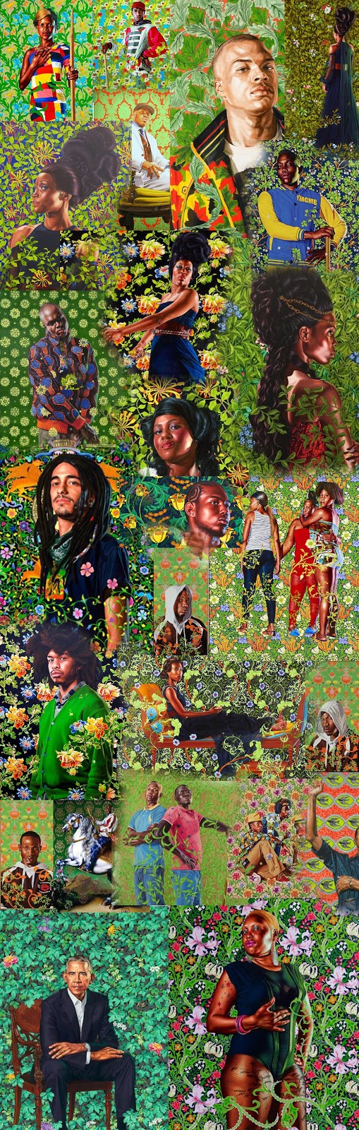
Green is very common background color in Wiley's paintings. He frequently uses a bright yellow green with yellow and yellow orange accents in the background patterns. These three adjacent colors on the color wheel form an analogous color scheme.


His backgrounds are often floral patterns and he uses the below analogous combination that is frequently found in nature.


Analogous colors are usually calming. It is how he adds the complimentary colors that gives his signature bravura look. The subject might be wearing red against the green background. If the subject is wearing bright green there will be more blues purples and reds in the background.  

He uses variations of reds such as ochres, siennas, and umbers for the skin tones. There is no black skin like in a Kerry James Marshall painting. These colors are on the opposite side of the color wheel from the background colors. The figure often appears as if it pops from the background. Using backlighting intensifies this effect.


The Obama Presidential Portrait is where he stepped away from his wild contrasts.


The few purple and red flowers are small and widely spaced. The flowers were selected for their meaning in Obama's life. Purple African lily for his father's African heritage, white jasmine for his Hawaiian birthplace, multicolored chrysanthemum for the city of Chicago, and rose buds for love. 

Many had their doubts as to whether Kehinde Wiley could make a dignified Presidential Portrait. Most Republicans still do.

Monday, March 5, 2018

The Battle for Literacy and Soviet Avant-garde Posters


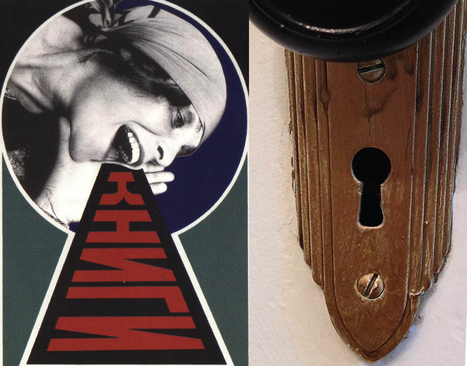
One of my favorite Soviet Avant-garde posters is a poster for the Leningrad State Publishing House. Alexander Rodchenko made this iconic photomontage in 1924. It is one of many propaganda posters to eliminate illiteracy. When the Bolsheviks came to power in 1917, male illiteracy was estimated at 60%, and female was close to 90%. The rates were even higher in rural areas. To Lenin literacy was a major priority. "Without literacy, there can be no politics, there can only be rumors, gossip and prejudice." One of Lenin's early programs was Likbez – an acronym for "likvidatsiya bezgramotnosti",  "elimination of illiteracy."

The three Cyrillic letters Л Е Н on the black background correspond to the Latin letters LEN for Leningrad. Г И З on the red is GIZ, the initials for gosudarstvennoe izdatel'stvo -State Publishing House. Russians love to use acronyms or names formed from abbreviations. The publishing house was known as LENGIZ. It was a designer's dream for Rodchenko that the red and black could symmetrically divide the the two syllable acronym. The woman has her hand against her mouth and is shouting the words "books in all branches of knowledge." Over the black background in the shape of a megaphone is the word книги (KNIGI or books). The woman is Lilya Brik, the wealthy Jewish mistress of futurist poet, playwright, and artist Vladimir Mayakovsky. She also was the wife of the writer and literary critic Osip Brik. Mayakovsy later moved in with the Briks. Rodchenko frequently collaborated with Mayakovsky on designs for the literary and art magazine LEF. Almost everyone in the Russian and Soviet Avant-garde knew each other, Many of them, and even Matisse, did portraits of Lilya and her sister. 

In the poster, Lilya is wearing a head scarf emblematic of the proletariat and peasantry. In the early years after the Revolution, literacy classes were hindered by a distrust between the peasant students and the teachers with a petty bourgeois background. In the lower right corner are Alexander Rodchenko's initials in Cyrillic– PA..  Being an advertising and propaganda poster, it had no name, but now it is often called Books. 

Rotate the poster 90 degrees and an old-fashioned lock appears that can be unlocked through literacy.


Russian and Soviet Avant-garde posters used heavy and bold futuristic fonts, not the thin, squiggly, curved and whiplash fonts of Art Nouveau. The fonts had simplicity and were sans-serif. The colors of the posters were bold and pure with rarely any different shades. Red and black was a common color combination.


Here are some post Revolutionary and early Soviet posters about fighting illiteracy:


Knowledge Will Break the Chains of Slavery
Alexei Alexandrovich Radakov, 1920.


If you will not read books, you will soon forget the grammar.1925.


Literacy is the road to Communism, 1920, in Russian and Yiddish.


The illiterate person is a blind man: Everywhere pitfalls and misfortunes await him.
Alexei Alexandrovich Radakov, 1920.


 Night of the BooksVarvara Stepanova, 1920.
(Stepanova was married to Rodchenko)


Peasant woman, consolidate the unity of workers and peasants,1925.


In 2014 David Redon combined famous musicians and performers with vintage advertisements. He used Beyoncé in his parody of the Rodchenko poster.


It's an interesting parody, but the early Soviet feel is lost with his red and pink combination.


To see more of Redon's vintage advertisements go to:

https://www.designboom.com/art/david-redon-remix-vintage-american-ads-pop-icons-04-04-2014/


Saturday, February 17, 2018

Restoring another Image for Eberly

Eberly had this image which was taken on a Blackberry with a 2MP camera. She wanted to have me fix it up.


I wanted to hold back on overcorrecting the image so it would still retain an Impressionist feel.


Wednesday, February 14, 2018

Kehinde Wiley and Matisse's Decorative Style

It is not difficult to recognize a Kehinde Wiley portrait with its arabesque, often floral pattern that comes out of the background and goes in front of the subject.


Matisse in his Harmony in Red (called Red Room or Krasnaya Komnata by The Hermitage Museum in Saint Petersburg, Russia) has a floral pattern as wallpaper that becomes also the table cloth. 


The flower arrangement in the pattern also becomes the still life flowers on the table. In Prince Albert, Prince Consort of Queen Victoria from the series Jamaica, 2013, Wiley has the tattoo design on the male subject as part of the background pattern.


Matisse's decorative phase was temporary and often derided by critics. Wiley with the exception of some of his stained glass works, doesn't appear to be giving up this style. The recent Obama portrait will probably bring more demand for his patterned portraits.


Young adults and children are fans of Kehinde Wiley. When The World Stage: Jamaica, came to London in 2013 there was a Tate Talk, Q&Artist: Kehinde Wiley Curated by and aimed at 15–25 year-olds. On school tours the students are more involved with a Kehinde Wiley than they are with the OLD MASTERS.


Wednesday, November 15, 2017

Can Aunt Jemima be Rehabilitated?

There is no question that earlier representations were racist and offensive. However she has provided the source for some famous art works during her rehabilitation. In 1963, Jeff Donaldson, later one of the founders of the AfriCOBRA art movement, revealed his confrontational interpretation in a battle – Aunt Jemima and the Pillsbury Doughboy.


This arguably is the first work where we have an empowered Aunt Jemima instead of an overweight mammy archetype.

In 1972 Betye Saar gave Aunt Jemima a rifle and a hand grenade in her famous assemblage The Liberation of Aunt Jemima.


In 1998 Renée Cox had her become a super hero figure in her collage The Liberation of Aunt Jemima and Uncle Ben.


In 2014 Kara Walker morphed the mammy stereotype into a powerful sphinx in her installation A Subtlety, or the Marvelous Sugar Baby, at the defunct Domino Sugar factory in Brooklyn.


There are no weapons or battles. The monumental size and historical meaning of a sphinx gives her power. The thumb of her left hand is in the figa sign which in some cultures is an obscene gesture and in many countries is a sign of refusal.

The Quaker Oats Company is still using the same image that was on the 1998 package in Renée Cox's collage. If Aunt Jemima is going to stay with us, she could use an updated image.