Thursday, March 17, 2016

Degas' use of Negative Space to Achieve Balance in the Highly Asymmetric Picture "The Dance Class."

                                                                                                          
The Dance Class is a very asymmetrical picture by Degas painted in 1874. I have heard people erroneously call the painting unbalanced. Asymmetry and balance are two different design concepts. At first glance, the girl in the foreground seems to be responsible for this unbalance. Degas uses many techniques, that are today taught in introductory design classes, to achieve a very balanced design.


He uses more of the color red on the right side and in the background. It is not much of a weighting away from the girl in the foreground but all these little elements will add up to balance the picture. The reds are more saturated than the light colors of the picture, and a little red goes a long way as strong accent color for balance.


Both the tall girl on the left and the Dance Master are looking at the dancer with her arms reaching out. The eyeline match is a powerful technique to take our attention away from the foreground. In the next century Alfred Hitchcock would use eyeline  matches to direct the viewer to what he wanted to emphasize. It's very obvious in Rear Window (1954). In Vertigo (1958) Kim Novak is looking at the painting of Carlotta and Jimmy Stewart is looking at Kim Novak. Stewart shifts his gaze downward to a bouquet of flowers on the bench next to Kim Novak. The next shot is an eye line match to the flowers, and then camera zooms in and pans up to the bouquet in the painting. We infer that Stewart has just seen the bouquet in the painting. The next shot is of Jimmy Stewart not looking down but up at the painting and the curl in the back of Kim Novak's hair. The sequence repeats to see the curl in the painting. 


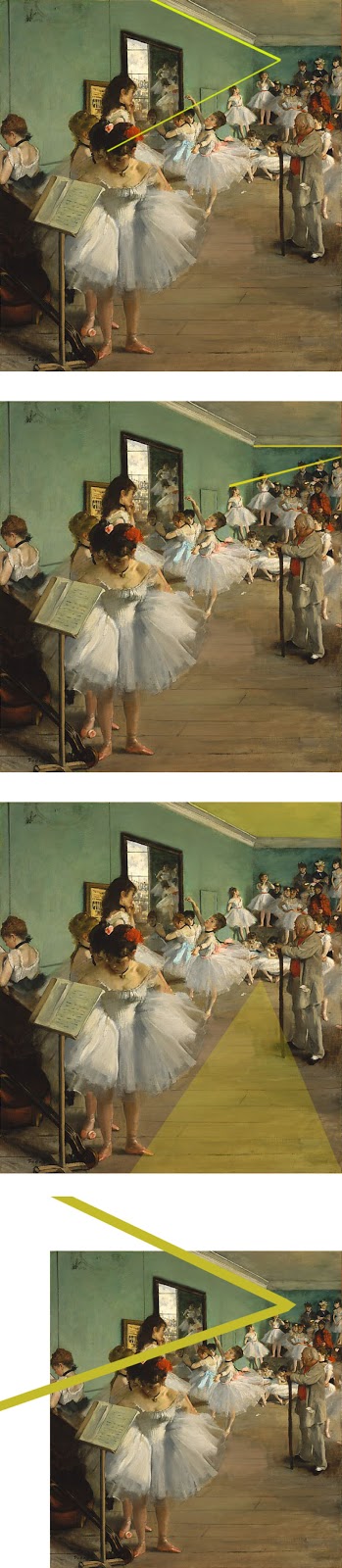
The girl, the Dance Master is watching, unifies the mid ground and background as she points to the corner of the mirror and her head starts a vanishing point to to the two girls on the wall.
The foreground dominance of the girl hiking up her tutu is attenuated by the grouping of the four heads behind her.


The empty space in front of the Dance Master has at times been compared to the flat empty space of Japanese prints. There is a vanishing point as the floorboards get closer in the background and the space is not really flat. Objects in a design are called positive space. The space between objects is referred to as negative space. Negative space has a shape that can be used to balance an asymmetrical image.


The shape of this space leads the eye to the group of dancers in the background.


The head of the girl in the foreground is also balanced by girls along the left wall to the background.


The ceiling molding also complements the vanishing point of the girls along the wall.


The back wall ceiling molding complements the people who are standing by the wall.


There is top to bottom balancing of the negative space of the ceiling with the floor.


Although very similar to a previous angle, the ceiling molding unifies the entire left wall and reduces the impacct of the foreground girl.
I had a graphics and typography instructor who very rarely used the term negative space. He felt that the word negative had the connotation that it was not important. If a student placed some type too close to the edges, he would say, "Let's move it away from the edge and give it some room to breathe."

There is a practical reason for the negative space around the Dance Master. He is the person in charge and the students know he needs some space to work, and that he doesn't want the students crowding him.

The more I look at this painting, I see more details that balance and unify the picture. As I focus on smaller areas my mind keeps finding areas of symmetry such as the two sides of the tutu that the girl is pushing forward. There also is the "mirror" image of the three girls who are practicing in front of the mirror.                                                    

When I made frequent trips to NY in the 1990's I usually went to The Metroplolitan Museum of Art to see the special exhibits. Even if I were running late after seeing an exhibit I would run up the stairs to go to the 19th and early 20th century European galleries and take a quick look at the paintings I was familiar with. I hadn't taken any graphic or art classes at that time. However there were several paintings that I kept returning to see, if only for a few moments. Yes, The Dance Class was one of my favorites.

Thursday, March 10, 2016

The Yellow – Blue Contrast in Van Gogh's Paintings

The vivid colors that we associate with Vincent Van Gogh are a major feature of   his work after he moved in 1888 to Arles, in the South of France. He was fascinated with the yellow and golden colors of the flowers and wheat fields. He used a wide range of the complementary colors in the blues to produce this magnificent contrast. In RGB, yellow is the opposite of blue. Orange is the opposite of azure. Golden colors are between yellow and orange. Van Gogh used a lot of complementary shades of blue that are between blue and azure. When you look at one of these paintings the eye is optically mixing these complementary hues. Optically mixed opposite colors are more vivid than either color alone.

Tuesday, March 8, 2016

The Orange Color in Gauguin's Paintings.


For over fifty years I associated that any painting about Tahitian women and orange color was probably done by Paul Gauguin. Now that I am taking a class in the history of modern art, I've modified my notion. Before Gauguin made his first trip to Tahiti in 1891, the orange color can be seen in some of his paintings such as his self portraits and The Yellow Christ. It is during that first trip to Tahiti that orange becomes so prominent in his work – in the background or the skin tones of the women

Monday, March 7, 2016

The Red and Black in John Singer Sargent

When I was in grade school, my parents frequently took me to the Museum of Fine Arts, Boston. I had this notion that John Singer Sargent was the person who painted portraits in red and black. This red and black contrast Is seen in many of his studio portraits of the 1880’s but almost never in his landscapes. The twelve portraits Sargent did from 1898 to 1908 of the Wertheimer family of London were displayed at the Jewish Museum in New York from October 1999 to February 2000, and do not have a red and black contrast. Since Sargent did more than 2,000 water colors and about a thousand oil paintings, the red black combination is less than 2% of his oeuvre. However, it is a very vivid childhood memory I have of his paintings.