Wednesday, April 6, 2016

Finding the Caravel

In the Modern Art Class that I am taking, we were discussing Cubism.  The instructor projected an image of Braque’s The Portuguese  as an example of analytical cubism. He explained how the objects in the picture  have been broken into pieces and then re-assembled so you can see them from multiple angles at the same time. He asked if anyone could recognize any objects in the painting. The name  of the painting was The Portuguese and the Portuguese were at the vanguard of overseas exploration sailing to Newfoundland before Columbus came to America. A few years later, there were exploations to Brazil and around Africa to reach India. I instantly saw a caravel – the ship used by the Portuguese in the 15th and 16th centuries. I tried to explain where the sailing ship was. 

The instructor couldn’t see it. Nobody else in the lecture hall could see it. It was suppose to be some musical instrument that Picasso in a similar painting had deconstructed. My pride was wounded with another wrong answer. The caravel image kept getting more real to me. I couldn't give it up.


A little research paid off. William Cloonan in his 1960 article in The French Review, Braque's Le Portugais and a Portuguese Nun noted the ship in the lower right corner.

Thursday, March 17, 2016

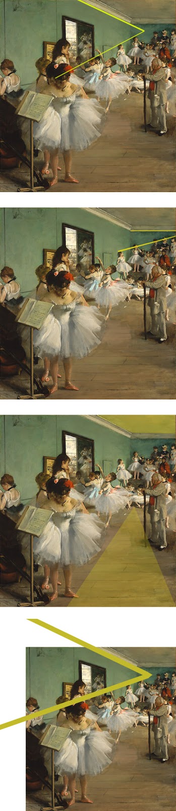
Degas' use of Negative Space to Achieve Balance in the Highly Asymmetric Picture "The Dance Class."

                                                                                                          
The Dance Class is a very asymmetrical picture by Degas painted in 1874. I have heard people erroneously call the painting unbalanced. Asymmetry and balance are two different design concepts. At first glance, the girl in the foreground seems to be responsible for this unbalance. Degas uses many techniques, that are today taught in introductory design classes, to achieve a very balanced design.


He uses more of the color red on the right side and in the background. It is not much of a weighting away from the girl in the foreground but all these little elements will add up to balance the picture. The reds are more saturated than the light colors of the picture, and a little red goes a long way as strong accent color for balance.


Both the tall girl on the left and the Dance Master are looking at the dancer with her arms reaching out. The eyeline match is a powerful technique to take our attention away from the foreground. In the next century Alfred Hitchcock would use eyeline  matches to direct the viewer to what he wanted to emphasize. It's very obvious in Rear Window (1954). In Vertigo (1958) Kim Novak is looking at the painting of Carlotta and Jimmy Stewart is looking at Kim Novak. Stewart shifts his gaze downward to a bouquet of flowers on the bench next to Kim Novak. The next shot is an eye line match to the flowers, and then camera zooms in and pans up to the bouquet in the painting. We infer that Stewart has just seen the bouquet in the painting. The next shot is of Jimmy Stewart not looking down but up at the painting and the curl in the back of Kim Novak's hair. The sequence repeats to see the curl in the painting. 


The girl, the Dance Master is watching, unifies the mid ground and background as she points to the corner of the mirror and her head starts a vanishing point to to the two girls on the wall.
The foreground dominance of the girl hiking up her tutu is attenuated by the grouping of the four heads behind her.


The empty space in front of the Dance Master has at times been compared to the flat empty space of Japanese prints. There is a vanishing point as the floorboards get closer in the background and the space is not really flat. Objects in a design are called positive space. The space between objects is referred to as negative space. Negative space has a shape that can be used to balance an asymmetrical image.


The shape of this space leads the eye to the group of dancers in the background.


The head of the girl in the foreground is also balanced by girls along the left wall to the background.


The ceiling molding also complements the vanishing point of the girls along the wall.


The back wall ceiling molding complements the people who are standing by the wall.


There is top to bottom balancing of the negative space of the ceiling with the floor.


Although very similar to a previous angle, the ceiling molding unifies the entire left wall and reduces the impacct of the foreground girl.
I had a graphics and typography instructor who very rarely used the term negative space. He felt that the word negative had the connotation that it was not important. If a student placed some type too close to the edges, he would say, "Let's move it away from the edge and give it some room to breathe."

There is a practical reason for the negative space around the Dance Master. He is the person in charge and the students know he needs some space to work, and that he doesn't want the students crowding him.

The more I look at this painting, I see more details that balance and unify the picture. As I focus on smaller areas my mind keeps finding areas of symmetry such as the two sides of the tutu that the girl is pushing forward. There also is the "mirror" image of the three girls who are practicing in front of the mirror.                                                    

When I made frequent trips to NY in the 1990's I usually went to The Metroplolitan Museum of Art to see the special exhibits. Even if I were running late after seeing an exhibit I would run up the stairs to go to the 19th and early 20th century European galleries and take a quick look at the paintings I was familiar with. I hadn't taken any graphic or art classes at that time. However there were several paintings that I kept returning to see, if only for a few moments. Yes, The Dance Class was one of my favorites.

Thursday, March 10, 2016

The Yellow – Blue Contrast in Van Gogh's Paintings

The vivid colors that we associate with Vincent Van Gogh are a major feature of   his work after he moved in 1888 to Arles, in the South of France. He was fascinated with the yellow and golden colors of the flowers and wheat fields. He used a wide range of the complementary colors in the blues to produce this magnificent contrast. In RGB, yellow is the opposite of blue. Orange is the opposite of azure. Golden colors are between yellow and orange. Van Gogh used a lot of complementary shades of blue that are between blue and azure. When you look at one of these paintings the eye is optically mixing these complementary hues. Optically mixed opposite colors are more vivid than either color alone.

Tuesday, March 8, 2016

The Orange Color in Gauguin's Paintings.


For over fifty years I associated that any painting about Tahitian women and orange color was probably done by Paul Gauguin. Now that I am taking a class in the history of modern art, I've modified my notion. Before Gauguin made his first trip to Tahiti in 1891, the orange color can be seen in some of his paintings such as his self portraits and The Yellow Christ. It is during that first trip to Tahiti that orange becomes so prominent in his work – in the background or the skin tones of the women

Monday, March 7, 2016

The Red and Black in John Singer Sargent

When I was in grade school, my parents frequently took me to the Museum of Fine Arts, Boston. I had this notion that John Singer Sargent was the person who painted portraits in red and black. This red and black contrast Is seen in many of his studio portraits of the 1880’s but almost never in his landscapes. The twelve portraits Sargent did from 1898 to 1908 of the Wertheimer family of London were displayed at the Jewish Museum in New York from October 1999 to February 2000, and do not have a red and black contrast. Since Sargent did more than 2,000 water colors and about a thousand oil paintings, the red black combination is less than 2% of his oeuvre. However, it is a very vivid childhood memory I have of his paintings.


Friday, February 26, 2016

Designing a Museum Poster


When I was in El Paso in December I saw Marc Chagall's The Green Violinist at the El Paso Museum  of Art.


I've always loved this painting and saw it frequently at the Guggenheim during my trips to New York in the 1990's. When I took the Page Layout class in 2010 one of the first assignments was to design a museum poster. The Green Violinist is a very narrow painting that presents challenges to feature it in a  traditional sized poster with print advertising.

The poster I designed was for an exhibit about Jewish life in the shtetls or small villages of Eastern Europe. Since the primary focus of the exhibit was not Chagall's art, I didn't use the entire painting. The background without the angel emphasizes the style of the rural buildings . The orange and red colors of the violin are now more prominent and match the color behind the text. The violin player however is not seen on the roof. But again, the Fiddler on the Roof was not the focus of this exhibit.

The project was a class assignment at Saint Louis Community College. The poster was never commercially used.

The images of the poster at the bus stops were made in a digital photo editing program.

The use of this artwork is covered by fair use guidelines because the art image is readily available on the internet and is a low resolution copy that is unsuitable for commercial use.


Thursday, November 5, 2015

El precio de la fama


La gama de la música que se reproduce en un Strarbucks es increíble. Fue la ranchera más hermosa que había escuchado. La calidad técnica de la banda sonora era moderna pero la voz de la cantante era tan tradicional que parecía que venía  del pasado. Sólo unas pocas personas se encontraban en la tienda y por eso no había ruido. El volumen no era fuerte, pero la letra podía oírse fácilmente. Era como si la canción dominara el ambiente de la tienda. Había oído la canción, Tú Sólo Tú, antes en la emisora de radio La Ranchera 96.7 FM en Los Ángeles. Me obsesioné por aprender todo sobre Selena y mirar vídeos de sus actuaciones. Estaba yo consternado al saber que fue asesinada a la edad de 23 años por su amiga y persona de confianza por registros financieros. La  muerte catapultó su éxito en una figura de culto.

Aunque los especialistas de cultura popular coinciden que Selena es una influencia importante incluso después de su muerte pero ellos se diferencian en que la influencia es positiva o negativa. Muchas de las más conocidas feministas hispanas  opinan que ella no era un modelo a seguir positivo.

Lourdes Portillo hizo una película documental corta que críticamente examinó este aspecto de Selena. Sandra Cisneros ha sido muy crítica sobre su ropa provocativa y su comportamiento muy sexual. Después de haber pasado tantas horas leyendo y disfrutando de las obras de Cisneros, y sabiendo cómo Cisneros pasó de la pobreza del Lado Sureño de Chicago para convertirse en una gran escritora, estoy de acuerdo con Cisneros. Es muy improbable que las personas que vayan a la tumba y dejen cartas personales en la esperanza que Selena las lea, estén influenciadas por las obras de las feministas hispanas.

Me estaba quedando el mes en Long Beach, California cuando Jenni Rivera murió en un accidente del aeroplano. Long Beach es la ciudad de su nacimiento y crianza. La cobertura de los medios de comunicación y teorías de la conspiración sobre el choque continuó por semanas después de su muerte. Rivera no era probablemente el mejor modelo a imitar – su embarazo a la edad de 15 años , sus arrestos y una cinta de video de sexo.

Nunca he entendido por qué tantos artistas extremadamente talentosos trágicamente han perdido la vida durante sus carreras. Durante toda mi vida parecía  que esto les ha pasado a artistas  que realmente me han gustado.  Ritchie Valens, Buddy Holly y "The Big Bopper” en el mismo accidente del aeroplano en 1959,"Marilyn Monroe – 1962, Patsy Cline – 1963, Elvis – 1977. Me sentí traicionado cuando Grace Kelly abandonó Hollywood para convertirse en la Princesa de Mónaco, pero era muy difícil creer que ella murió en un accidente de coche en la misma carretera que yo había visto en su película  Para atrapar al ladrón.

¿Por qué una muerte prematura acelera la popularidad de nuestros iconos culturales y se hacen más populares en la muerte que cuando estaban vivos? ¿Son los Santos de nuestros días?

Wednesday, September 2, 2015

El verano de mi descontento


Durante el verano tomé  una clase de español en el Colegio Comunitario local. Estoy jubilado y no necesito prepararme para una nueva carrera o adquirir nuevas habilidades laborales. Me gusta aprender y he estado asistiendo a esta escuela por nueve años. Había tomado esta clase dos veces anteriormente pero quería mejorar habilidades básicas en español. Leo el periódico LA Opinión en línea casi todos los días y tengo un vocabulario extenso pero mi capacidad de utilizar los verbos es horrible. Verbos son los  burros de carga en un idioma. No va a pasar mucho con todos los sustantivos sofisticados sin un buen dominio de todas las formas y tiempos verbales.


El cartel publicitario de Raquel Welch con el "primer
bikini de la humanidad" en la película Un millón años
a.c.

En lugar de un curso de cuatro meses durante el año escolar regular, este curso se completó en seis
 semanas. La clase comenzó a las ocho y media de la mañana y terminó a mediodía. Volví a casa un poco antes de la una de la tarde y pasé las siguientes cinco horas delante a la computadora haciendo la tarea en línea ¬– cuatro días a la semana. Pero para ser justos con el maestro cinco horas no eran necesarias.  Había preguntas que requirieron la escritura de una respuesta y escribía por lo general un párrafo. Cada sección del libro de texto tenía un tema para el vocabulario – la industria de la moda, el empleo, el medio ambiente, entretenimiento, etcétera. Había esta pregunta sobre Raquel Welch y si ella es buena actriz. Probablemente me pasé dos horas escribiendo una composición acerca de todas sus películas que había visto en los últimos cuarenta años y el icónico cartel de cine de la película Un millón de años a.C 

que pegué en la pared de mi primer apartamento en 1968.

El ritmo de la clase fue frenético. Con el subjuntivo, el indicativo, los perfectos, y los imperativos con objetivos, había un nuevo tiempo verbal casi todos los días. En la tercera semana empecé a confundirme y no podía recordar cuándo se debe acentuar la letra i. Pensé que yo estaba viviendo una pesadilla. Tan pronto como llegaba a casa tenía que comer. Después de una hora en la computadora tenía que tener otra merienda. Entonces comenzó una cascada de problemas.  Gané ocho libras y era incómodo. No estaba durmiendo bien. Estaba cansado de tener que levantarme tan temprano en la mañana.
Al terminar la clase tenía yo entonces tanto tiempo libre que me parecía raro. Había aprendido mucho. Me adapté a un nuevo horario. Ahora puedo dormir más tarde en la mañana y perdí peso .

Wednesday, August 5, 2015

La dama de oro: la mirada hacia atrás en la colaboración Nazi de Austria.


La película, “La dama de oro” con Helen Miren y Ryan Reynolds, está basada en la historia verdadera de María Altmann una superviviente del Holocausto. El pintor simbolista austríaco Gustav Klimt hizo un retrato de la tía de María, “Retrato de Adele Bloch-Bauer”  Esta obra modernista fue hecha de aceite y láminas de pan de oro sobre lienzo. El retrato fue confiscado por los Nazis después del Anschluss – la incorporación de Austria a la Alemania nazi en 1938. Más de cincuenta años después del final de la segunda guerra mundial se necesitó casi una década para que María pudiera retener la obra maestra. Para entender realmente que la película es algo más que un drama de sala de tribunal sobre quién es dueño de la pintura, alguna información histórica es necesaria. María ha estado en una rabia por la actitud de Austria después del Holocausto. El “Asunto de Waldheim” revela sucintamente esta actitud de negación de Austria. Kurt Waldheim fue Secretario General de las Naciones Unidas entre 1972 y 1981, y luego Presidente Federal de Austria entre 1986 y 1992. Durante su mandato como presidente, había una creciente controversia mundial que Waldheim había mentido acerca de su servicio en una división paramilitar del Partido Nazi y también había mentido sobre su servicio como un oficial en las SS. El gobierno austríaco decidió consultar a un comité internacional de historiadores. El reporte final declaró que Waldheim debía saber más de lo que estaba dispuesto a admitir. Gran parte de la controversia sobre Waldheim era que el gobierno rechazó admitir el papel de Austria en el Holocausto.  A partir de 1970 adelante Austria rechazó investigar a ciudadanos austríacos que eran nazis mayores. Austria se negó a pagar indemnizaciones a las víctimas de la persecución Nazi. El arte confiscado de judíos que vivían en  Austria seguía siendo propiedad pública. Waldheim y su esposa fueron declarados en diferentes países como personas no gratas. No se les permitió entrar en los Estados Unidos.  

Demandas mundiales de Austria a reconocer su implicación Nazi, siguieron aumentando durante la década de 1990. Demográficos habían  estado cambiando en Austria y Los Verdes un partido político ecologista y la generación más joven tenían más poder. Se aprobó una nueva ley en 1998, para facilitar el acceso a los documentos y para dar más transparencia en la restitución de las obras de arte saqueadas durante el período Nazi. Es en este tiempo que María comienza su causa judicial.

Ella vivía a en Los Ángeles y ha contratado a Randol Schoenberg un abogado inexperto joven cuya madre era su amiga. En la vida real hubo una diferencia de cincuenta años entre María y Randol. Ella cariñosamente lo llama Randy y lo trata como si fuera su hijo. Varios críticos de la película han comentado que Ryan Reynolds es un actor demasiado inexperto para actuar frente Helen Miren. Algunos han dicho que él  no es creíble como un abogado. Bueno, es que lo que era la interacción en la vida real.


Randy tiene una conexión más profunda a esta demanda que sólo un abogado. Él es judío y de ascendencia austríaca. Randy Schoenberg es nieto de Arnold Schoenberg y Eric Zeisl, dos compositores austríacos. María no había vuelto a Austria hasta el procedimiento judicial. Ella tiene tanta indignación sobre esta injusticia que rechazó hablar alemán. Un periodista de investigación en Viena, Hubertus Czernin, ayuda Schoenberg navegar a través del laberinto burocrático. Czernin fue el primer periodista para acceder a los registros en la Galería Austriaca en Viena. Él publicó una serie de artículos sobre la titularidad de cinco pinturas de Gustav Klimt. Los artículos dieron lugar a la aprobación de la Ley de la Restitución de Arte de Austria. En la película él representa el Nuevo Austria. No hay ninguna escasez de austríacos obstinados durante las escenas de los procedimientos judiciales. En la vida real  María Altmann dijo a los reporteros después de la exitosa decisión “Sin Hubertus, no habría habido nada.”

La película termina con María regresar a su casa en Viena, que en la actualidad es una oficina. Hay un recepcionista joven en un escritorio. Le dice que solía vivir en el edificio y le gustaría echar un vistazo. El nuevo austriaco a le dice que ella es libre de mirar alrededor. María estaba hablando alemán.